The beginner's guide to colour theory
- Read time: 6 minutes
- Written by: Crafter's Companion
When it comes to colouring and art, colour is extremely important. Nobody wants a dull creation, after all! Even if you’re getting creative just for relaxation or fun, it’s worth getting your head around a bit of colour theory to get the effect that you’re looking for. We all know what it’s like when you picture something in your head, but you just can’t quite transfer it to your work. Colour theory can help!
So what exactly is colour theory? It’s the guidelines surrounding colour and colour pairings that are used globally by artists. They help to inform colour schemes and the message that you’re trying to convey through your work, so it’s pretty important to have a basic grasp of the key areas of colour theory.
We’ve put together this handy guide for beginners in colour theory to give a little bit more of an understanding and break down some of the most important aspects.

The colour wheel
The first job that the colour wheel does is to show you how colours are arranged along the spectrum (red, yellow, green, blue, and so on) and then identify them as primary, secondary and tertiary. This means it tells you the basic primary colours and the effect of mixing them together to create the secondary colours, plus the effect of mixing those secondary colours to make the tertiary colours.
The colour wheel helps you make sense of which colours ‘go together’ and is what’s behind any harmonious colour scheme. Take a look at the basic colour wheel below before we jump into the more intricate details!

Colour schemes
One simple way to create a harmonious scheme, is to choose colours that are adjacent on the colour wheel. You might use yellow and orange, or green and blue. This is known as an Analogous Colour Scheme. Because your colours are closely related by hue, they naturally sit next to each other without fighting too hard. You can create additional contrast here by introducing some different shades, tints and tones.
Alternatively, you might go for a Complementary Colour Scheme. This involves picking colours on directly opposite sides of the colour wheel. These colours will directly contrast against one another to create a strong compelling theme.
A Split Complementary Colour Scheme is when you go for the colour directly above and below the complementary colour on the wheel. This creates a really strong, impactful combination. Not for the faint hearted!
Or if you want something colourful and fun, but a little more balanced, you might try a Triadic Colour Scheme. This picks colours at regular intervals around the colour wheel for a combination that is interesting and varied.
Take a look at this little chart for a visual representation of each colour scheme.

Colour meanings
As well as creating a colour scheme that suits the project you’re working on, it’s also worth researching into the meaning of colours to see how they could impact your piece. Here are just a few examples:
Red – passion, intensity, excitement and energy
Orange – enthusiasm, creativity and fun
Yellow – warmth, happiness, positivity and concentration enhancing
Green – peace, harmony, nature and freedom
Blue – tranquility, honesty and relaxation
Purple – luxury, power, pride and mystery
Saturation
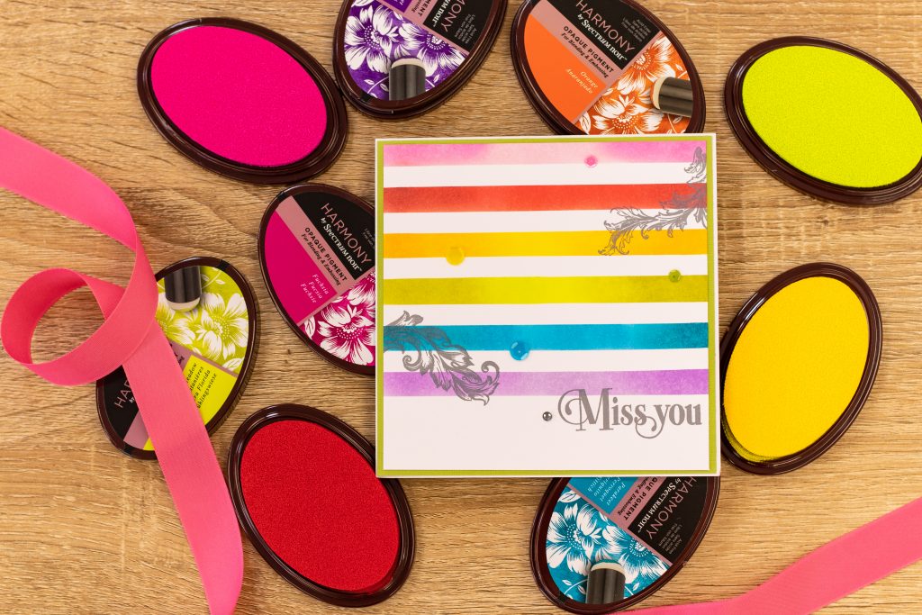
Saturation refers to the intensity of the colour. It’s not quite the same as light or dark, it’s more a case of how ‘pure’ the colour is. Highly saturated colours appear strong and punchy, whereas a de-saturated colour will look more subdued. A lot of the popular vintage colours used in home décor nowadays are good examples of de-saturated colours. Some can appear almost grey! A de-saturated colour scheme will generally be easier on the eye and create a more refined statement.
Value
In colour theory, ‘value’ is the sciencey term for how light or dark a colour is. If you can understand saturation, you can see how an intense, saturated colour can still be very light or very dark, depending on its value. Another way to think about it is to imagine the colour with black added or taken away, or if a strong intense colour was put in the shade. It would still be that same strong, intense colour. It would just look darker!
Hue
Hue is simply another word for colour. The hue is the basic true colour (imagine a colour of the rainbow) before it is altered to become a shade, tint or tone…

Shade
Shades are created by making a colour darker, so they are tied to the colour’s ‘value’ as described above. Shades can be quite dramatic, but you won’t want to use too many or else your design will be overpowering.
Tint
Also linked to the colour’s value, a tint is its lighter version. Tints are basically pastel colours, and will tend to look more soothing and feminine.
Tone
Tone is linked to the colour’s saturation. If we remember that saturation refers to how intense a colour appears, then we can understand a tone to be simply a more or less intense version of a colour. De-saturated (more grey-looking) tones will make your colouring page look subtle and sophisticated. Saturated tones will look more garish and shouty.

Temperature
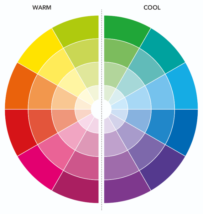
On the colour wheel, the warm colours sit on the opposing side to the cool colours. We can see how they deliver either a strong, cheery scheme or something more somber and mysterious depending how warm or cool you go. Notice red and yellow are linked to the more fiery, in-your-face sensations, whilst green and blue are more natural and calming. Red and yellow are warm colours, whilst green and blue are more cool.
We hope that this guide has given you an insight into some the key terms used when talking about colour theory. It’s so handy to know about colour theory so that you can be informed about the art that you’re creating and use colour to the best of its ability! We absolutely can’t wait to see how you put all of your new found knowledge to the test, so make sure you show us your projects and tag us in photos on Facebook, Twitter or Instagram using the hashtag #crafterscompanion. Enjoy the rest of Spectember!
